Case Study: Building Intuitivo’s Design System
Intuitivo, an innovator in automated retail solutions, set out to unify and streamline the user experience across its flagship products: A-POP and Wallet App. I collaborated with the team to design and implement a comprehensive design system that simplified digital interactions while reinforcing the brand’s identity.

Context and problem
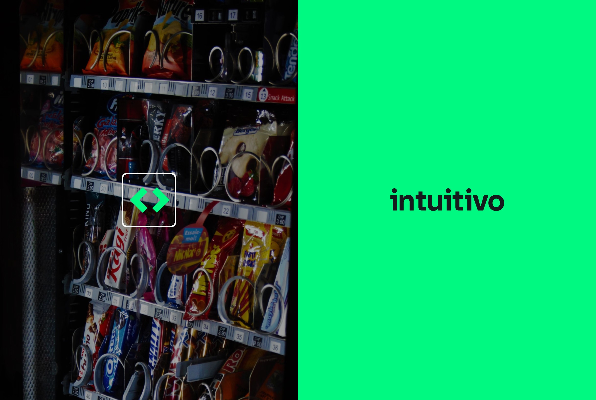
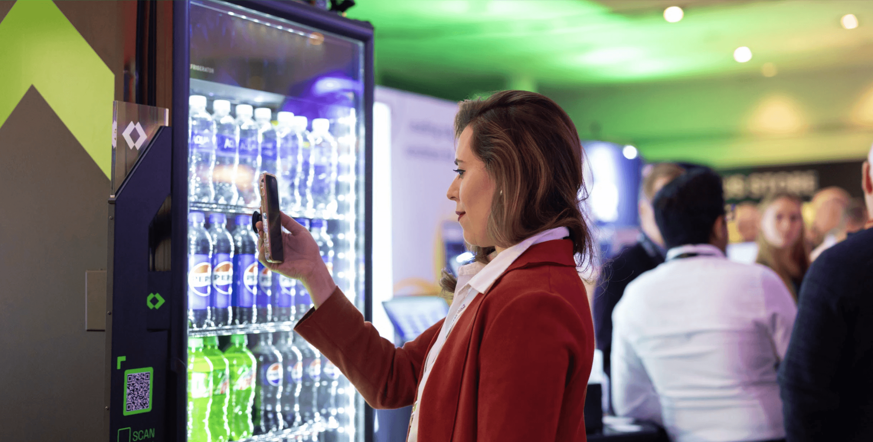
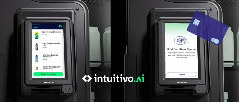
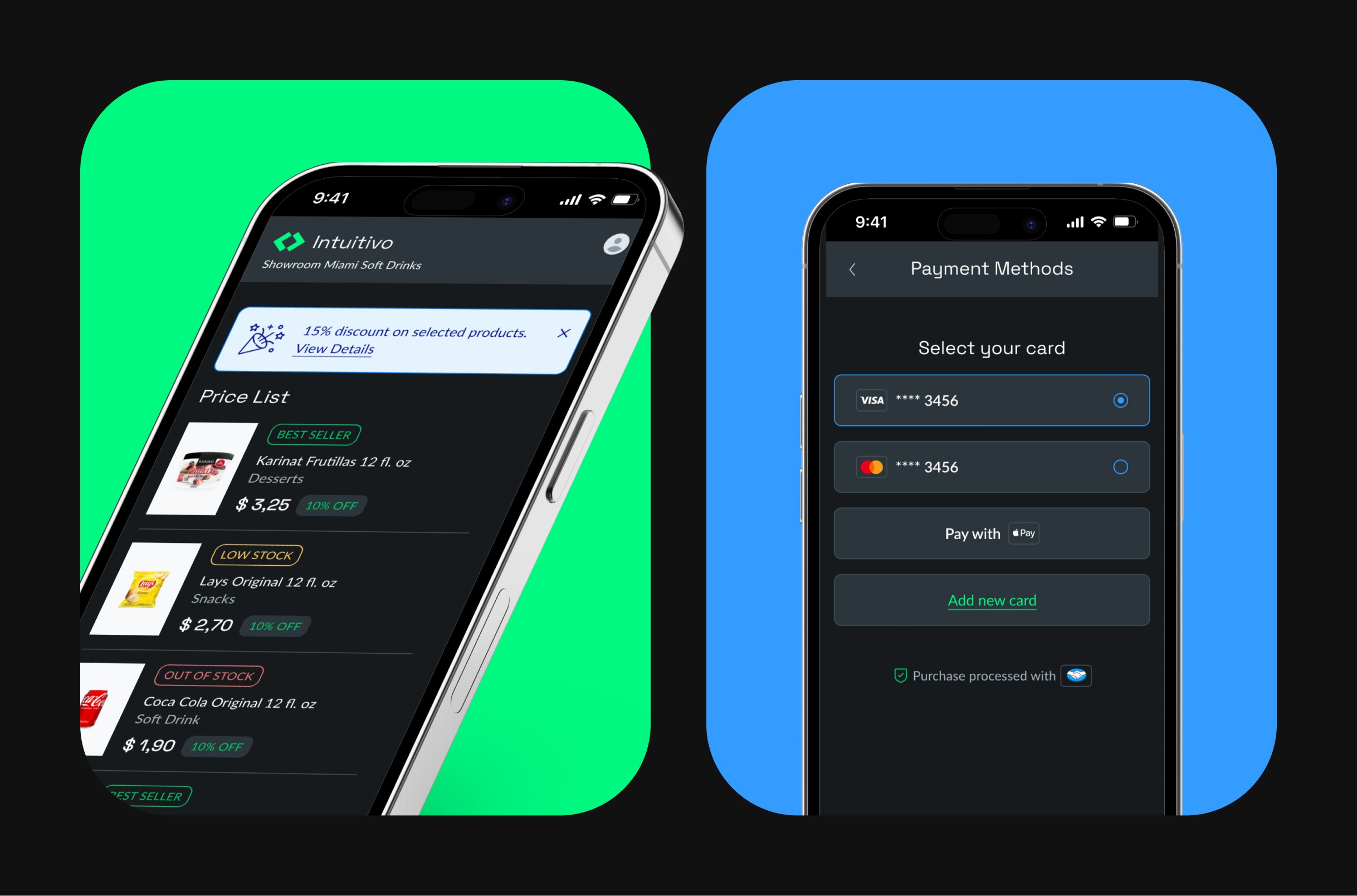
Intuitivo ships AI-driven vending machines (A-POP) plus a companion wallet app used by shoppers and store operators. Each squad shipped independently; after two years we had duplicated components, inconsistent UI behaviors, and handoffs that took ~5 days. Bugs in QA jumped because button states, typography, and spacing changed from screen to screen.
Goals
Create a single source of truth for visual + interaction patterns.
Cut design-to-dev time and reduce rework.
Deliver consistent flows across A-POP and Wallet so users see the same mental model everywhere.
Stakeholder interviews
Engineers flagged misaligned tokens and ad-hoc naming.
Ops requested faster way to skin vending UI for new partners.
Need for accessible color contrast, offline-first assets, and a structure that works for both portrait (Wallet) and landscape (machine).
Ideation & Workshops
Ran a 2-day workshop with PM + dev leads to define design principles (“Credible science”, “Fast to scan”, “Edge-ready offline”).
Co-created naming taxonomy (atoms → molecules → organisms) to mirror Brad Frost’s Atomic Design but tailored to Intuitivo.
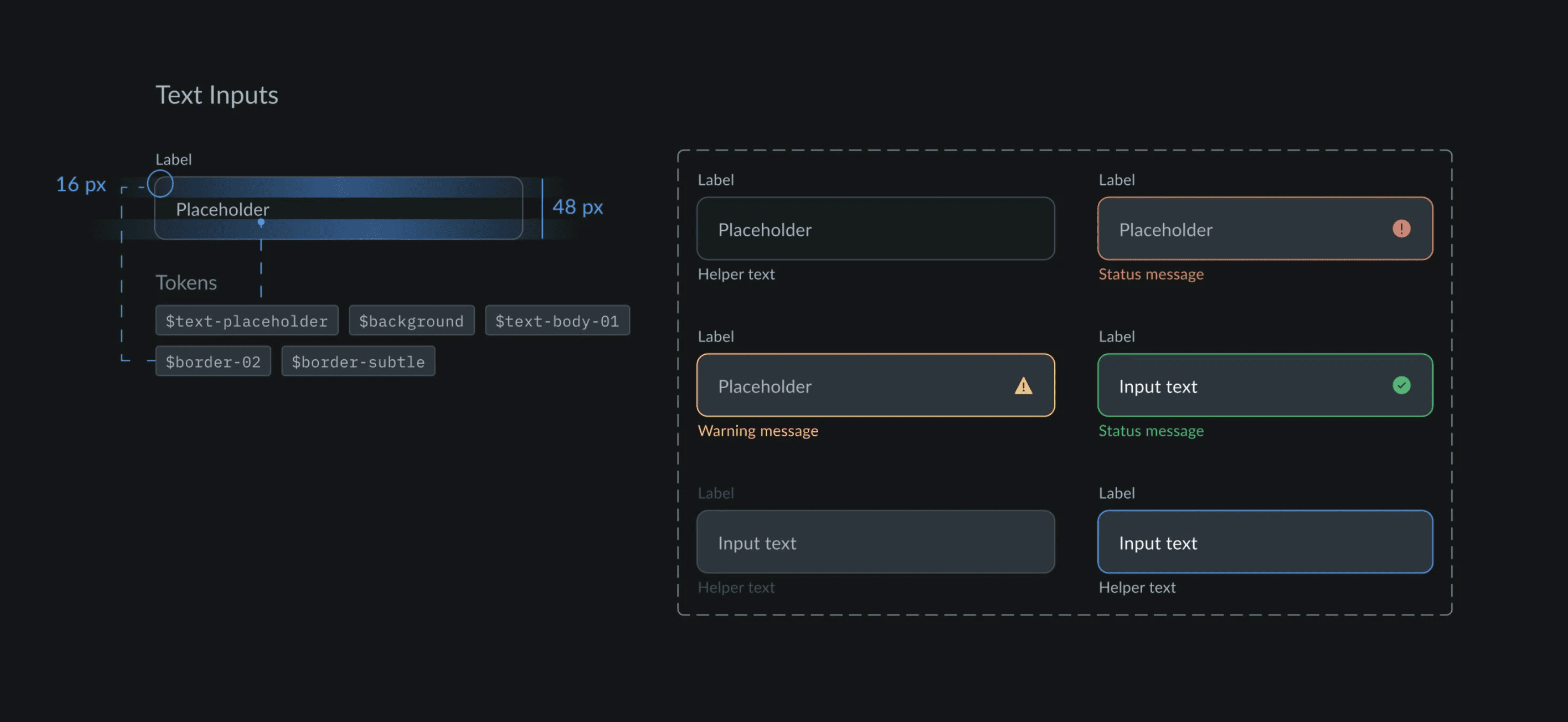
Set spacing tokens (8px baseline) after testing variants in Figma prototypes; engineers validated feasibility within existing grid.
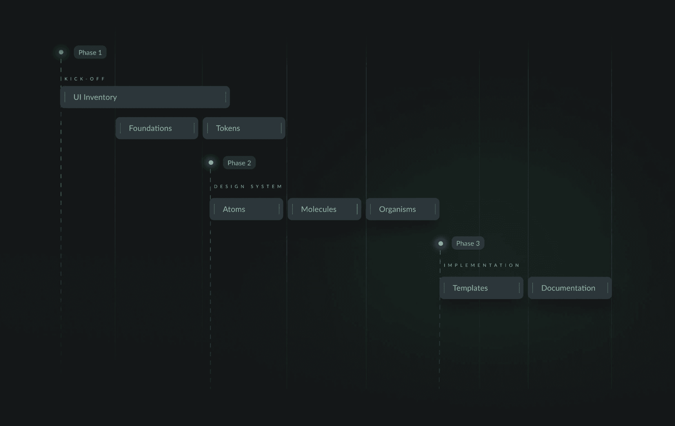
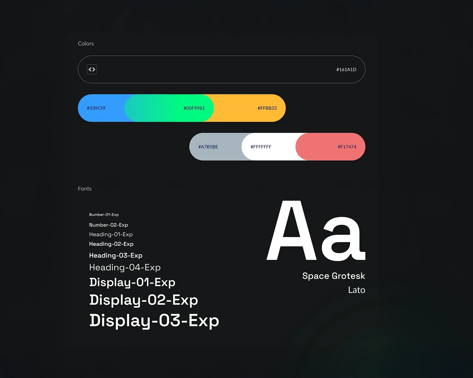
Foundations
Defined the key building blocks of the visual language:
Color palette: Created a cohesive palette aligned with Intuitivo’s brand identity.
Typography: Selected fonts for clarity, legibility, and personality.
Grid & spacing: Built a flexible grid system for consistency and rhythm.
Iconography: Designed an icon library to ensure clear, intuitive navigation.
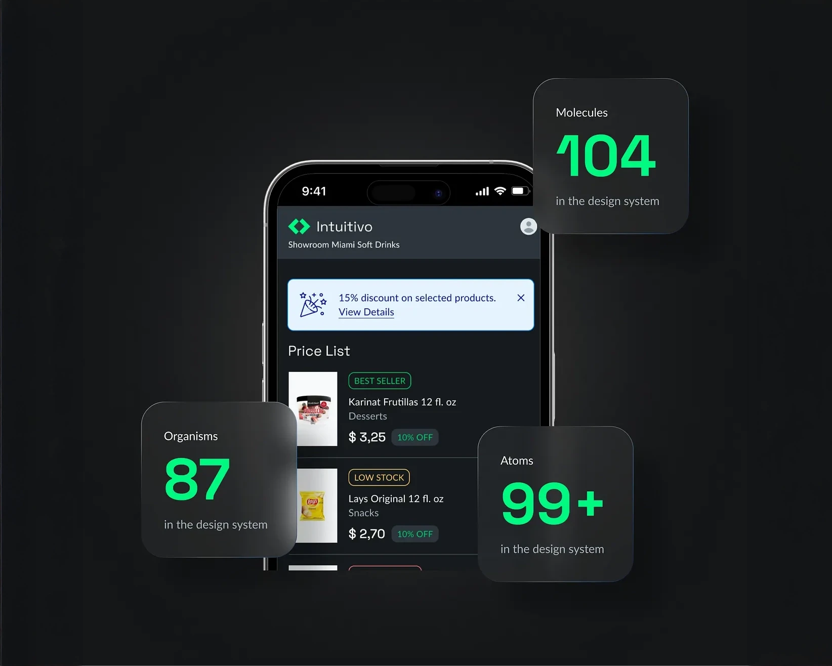
Atoms
Created basic UI elements including buttons, controls, inputs, and states that could be reused across screens.
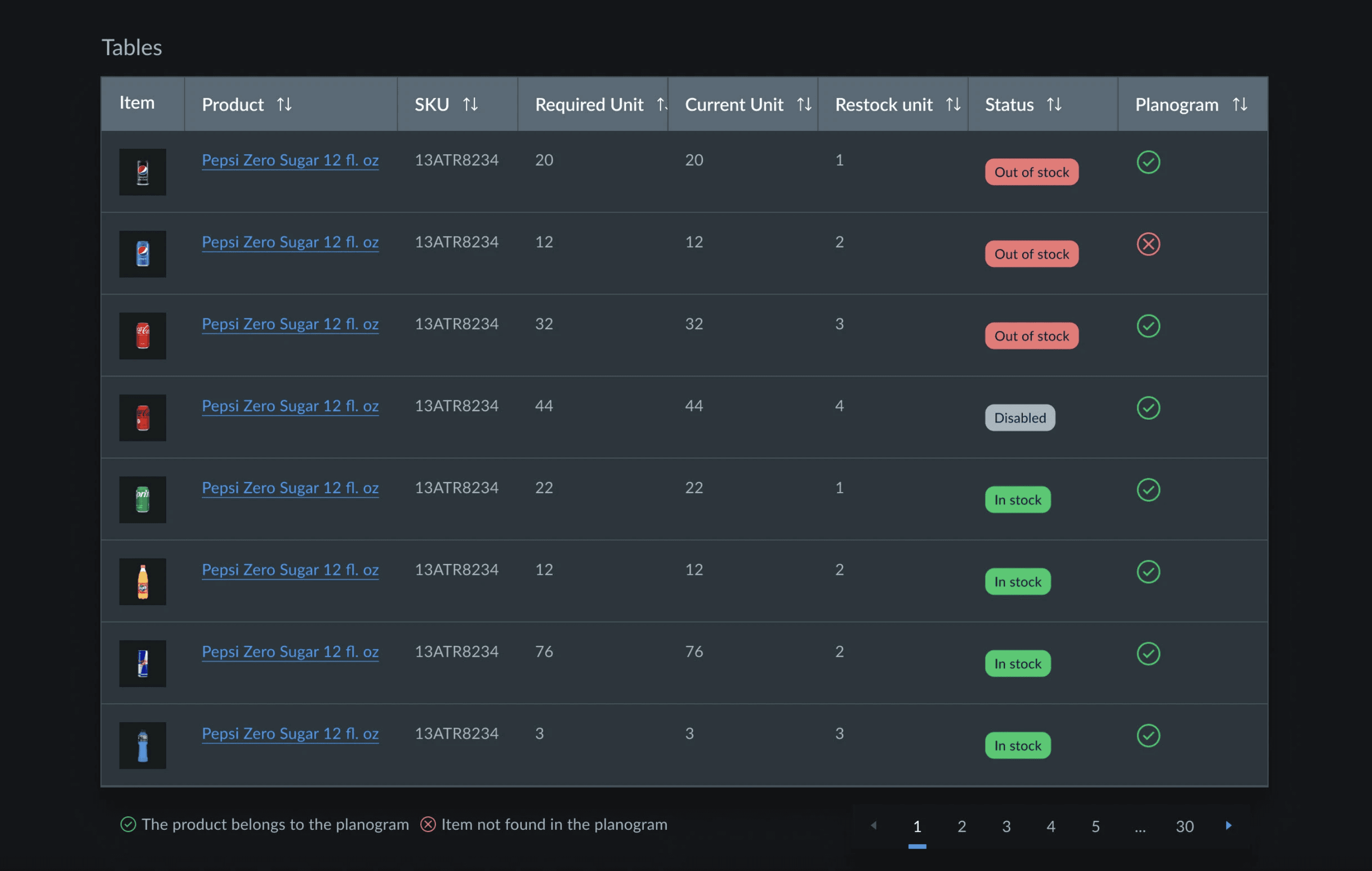
Molecules
Combined atoms into small, functional components such as cards, banners, and carousels to handle key interface patterns.
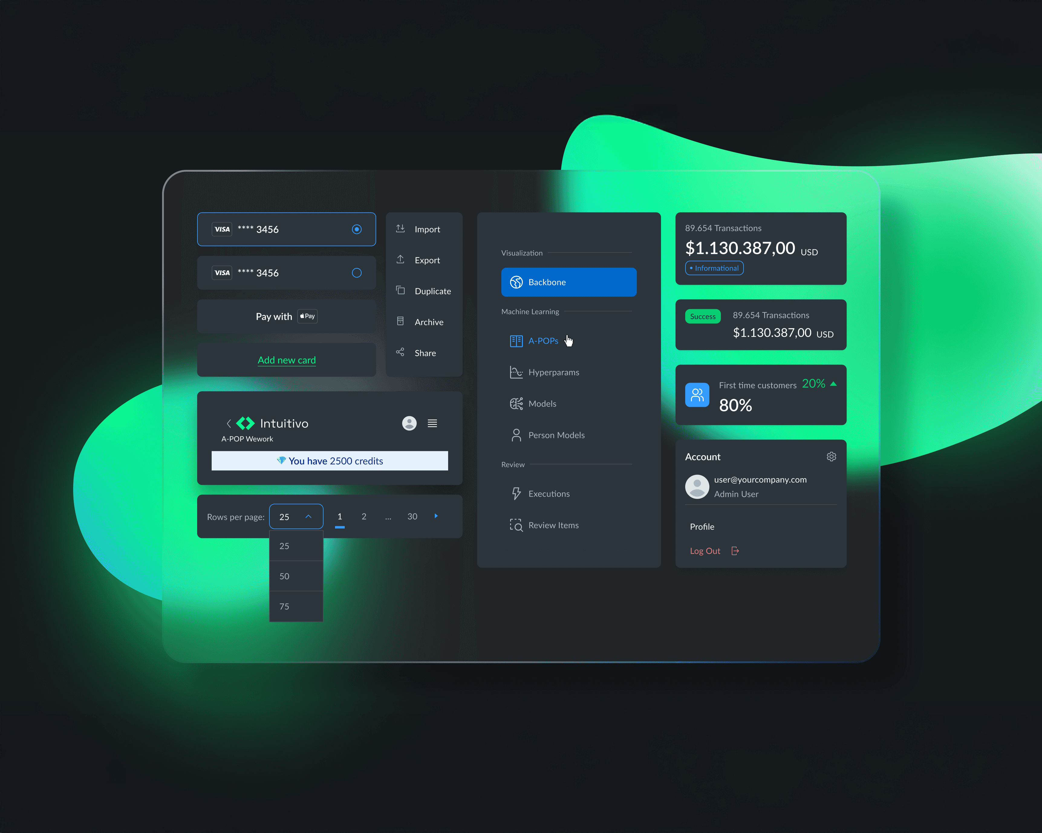
Organisms
Developed larger, interactive units like product cards, menus, and bottom sheets that combined multiple components for high-impact experiences.
Templates
Applied the system to key flows like onboarding and transactional screens, ensuring consistency across end-to-end user journeys.

Collaboration
This was a cross-functional effort involving designers, developers, and product managers. We created shared documentation and libraries in Figma, aligning everyone on a unified design language.
Results
Delivered a comprehensive design system with 167 components, including 99+ atoms, 104 molecules, and 87 organisms.
Reduced design-to-development time by streamlining handoff and documentation.
Increased product consistency, improving user trust and brand recognition.
Created a scalable foundation for future features and product lines.
Outcomes & impact
Design-to-dev cycle time: ↓ ~30% (handoff from 5 days to 3 days).
UI QA bugs: ↓ 40% after standardizing tokens (source: internal QA dashboard).
Partner onboarding: New vending partners can skin their UI faster.
Key Learnings
A design system is never static — it must evolve as the product grows.
Early alignment with engineering saves significant time downstream.
Documenting decisions is as important as the components themselves, to onboard new team members quickly.


