A distinctive product family, designed around production constraints
I designed the complete packaging system for AcnéClear, RosáceaRelief and MatchaGlow: from concept and visual hierarchy to artwork adaptation and production coordination. All three products are commercially available.
The brief
Create a recognisable packaging family for a growing skin-focused wellness brand, with a clear product hierarchy and a practical path to production. The challenge was to give each formula its own identity while keeping the range visibly connected.
Toci's idea of nourishing skin from within became the starting point for the packaging. I paired an expressive, oversized brand mark with restrained information design: a warm, approachable identity with a clear structure for product information.
I chose doypacks with the intention of using less plastic than conventional rigid jars. This was a design objective; no quantified material reduction or lifecycle comparison is claimed here.

A system built around two colors
I designed the artwork around a two-color constraint to simplify production and work toward a lower manufacturing cost. Instead of adding more decorative elements, I used typography, contrast, fine rules and a consistent layout to create distinction.
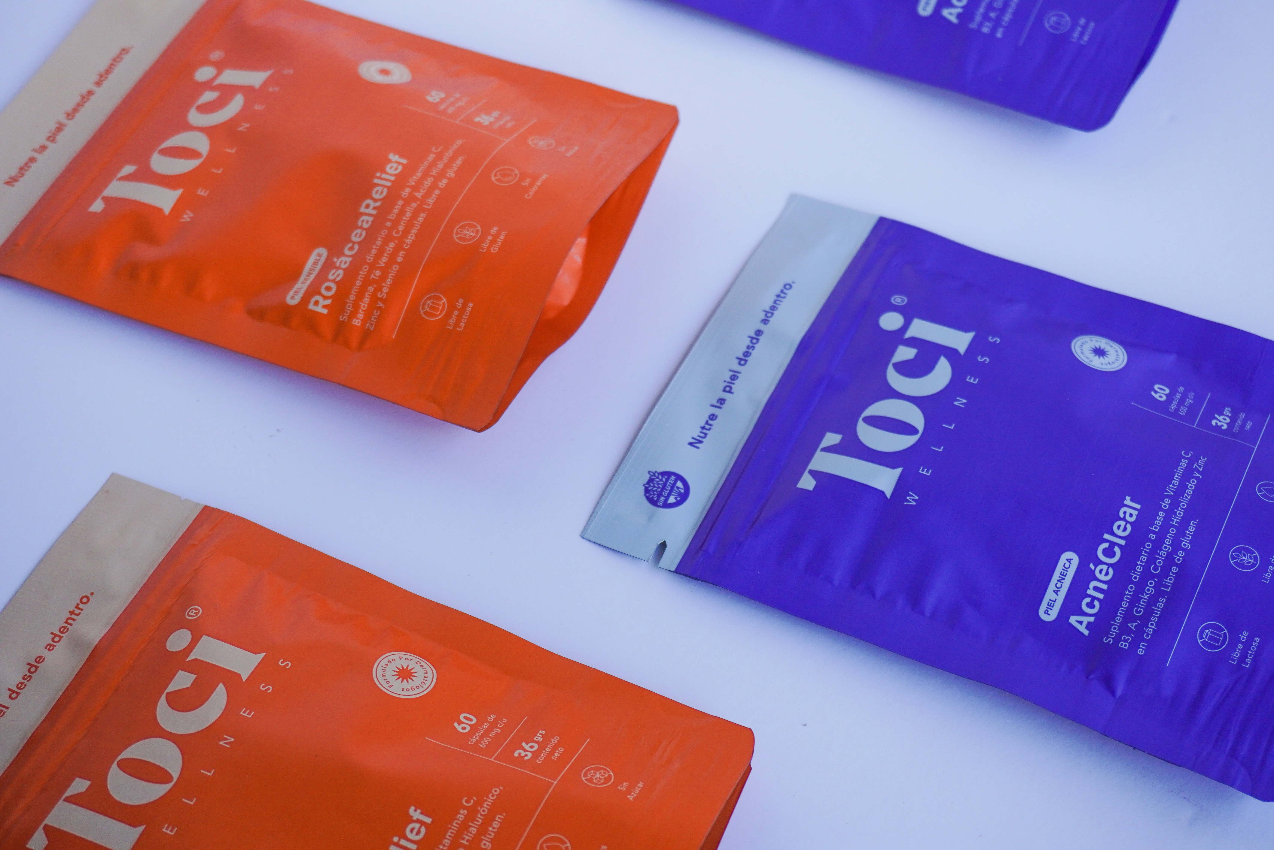
The same visual logic runs through the family: a prominent Toci wordmark, a short brand message across the top, the product name and description below, a separate area for key quantities, and a row of supporting icons. The artwork keeps the brand highly visible while giving each product a consistent place to communicate its details.

Three variants, one family
AcnéClear — blue-violet. A saturated field gives the pack a strong presence, with light typography preserving the hierarchy.

RosáceaRelief — orange. A different dominant color distinguishes the formula while retaining the same wordmark, information zones and icon language.

MatchaGlow — mint and green. The lighter field and green typography extend the system to a powder product. The product descriptor and quantity information change with the formula, while the overall structure remains familiar.

Reading the pack
Brand recognition: the large Toci mark establishes the family at a glance.
Product identification: the name and short descriptor distinguish the formula and format.
Supporting details: quantity information, fine dividing rules and icons organise the remaining front-of-pack content.
The packaging family


From artwork to production
I handled the packaging end to end, including the graphic design, format selection, artwork adaptation and production coordination. Limiting the design to two colors was a practical constraint that shaped the visual language from the outset.
Outcome
AcnéClear, RosáceaRelief and MatchaGlow are all commercially available. The result is a recognisable family that extends one identity across three formulas and into eCommerce and brand communication.
For me, this project demonstrates adaptive design in practice: preserving a brand's core language while responding to different content, formats and production constraints.
Production artwork: from flat layout to finished pouch
The original AcnéClear supplier proof shows the front (FRENTE), reverse (DORSO), dimensioned flat layout and the technical guides supplied with the artwork. It makes visible how the visual hierarchy and the detailed back-of-pack information sit within the same packaging structure.
The drawing labels a 390.00 × 118.33 mm flat layout, with 160.00 / 70.00 / 160.00 mm sections. These are dimensions from this specific proof, not the dimensions of the finished pouch front.


Color specification in context
The source proof lists white, PANTONE 6148 C and PANTONE 2725 C. The two-color constraint described above refers to the design approach; it is not a claim that the supplier used only two inks or plates in total.